Greetings all!
The interview I did with Brandon Badeaux was so good as well as detailed I was able to make two posts out of it. As you read in the first interview, Brandon did some work for the Batman: Arkham City game. Well, here is a more in-depth look at what it took to design such kick-ass characters!
1. What was your design process for Harley Quinn? Did you design alternate costumes for her?
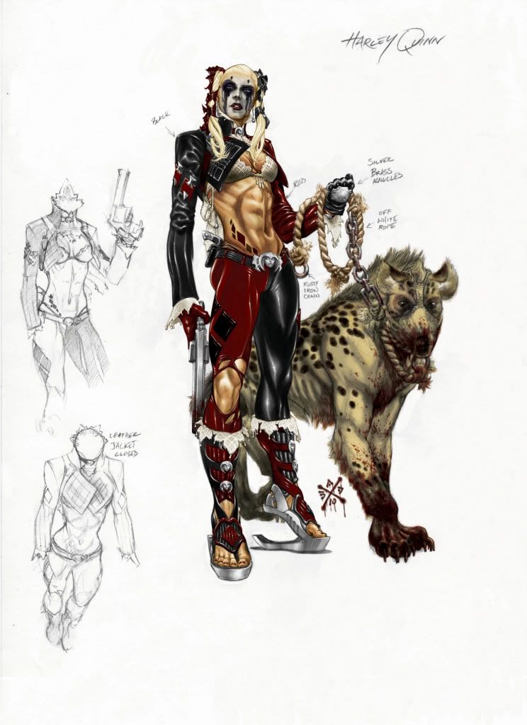
Harley Quinn was tricky for me I knew where I wanted to go with her but no one could get on the same page with her Rocksteady had their ideas, DC and Warner with theirs so both Carlos and I both worked on her and she ended up a hodgepodge of both of our ideas. Originally in the treatments they wanted her to look like a dominatrix which I wasn’t too keen on so my approach was to steer them in another direction though I have no real say in the outcome but I really love this character and I frequently see fans that loved those old comics I did with her so I really wanted some of that to come through. So my initial idea was to give her a Mardi Gras flare drawing inspiration from the harlequin clowns of the carnival season here keeping much of the original design from the cartoon series in place including the mask and ears and focused on adding more intricate lace and pearl beading to the costume adding a few modern accessories like shoes that actually had a heel that could provide some spring in her step. But I was told it looked like a renaissance fair and so the uniquely New Orleans look got scrubbed in favor of a more contemporary and sexy look and we were told that the hood wasn’t going to make it in. So it was back to the drawing board for a more contemporary modern flare so I focused on her face and hair to help inform the rest using colored ribbon and hair jewelry to form the iconic shape to her head that we are all familiar with and in all honesty these heads looked better than the hat. I think I did about nine or ten heads and unfortunately none were used, but if I did her in the comics again I can change her look throughout the book to match her mood. So there are elements of my design there and elements of Carlos’. But I really enjoyed the process for her even if she was the most difficult to nail down. But she ended up with a lot less skin showing that the original treatments which I was pleased with. But if I can I like to use new Orleans as the stand in for Gotham whenever possible we have old architecture, a culture that has some scary looking clowns with warehouses full of Mardi Gras floats containing stuff that could belong to the joker or Max Zeus, a broken down amusement park abandoned before Katrina, but ravaged by the storm. Some extremely nasty looking neighborhoods that could substitute for the narrows, a marsh outside the city where you can imagine Solomon Grundy lurking around and some big churches mixed in with the skyscrapers in the CBD. It’s perfect! so when I think of the joker or Harley my brain instantly thinks of home.
2. How many versions of each character did you have to do before DC and Rocksteady settle on a final design?
It depended on the character Harley and the final boss got more than fifteen drawings each while mister freeze I hit the nail on the head pretty quick, I mean I did more than one quick sketch but they picked my favorite design which I label with a big star and an email saying, “ Oh! Pick Me! Pick Me!!! So… not hundreds, but more than one.
3. Which character took the most revisions until you got approval? Did any of your character designs get approved immediately?
I think we were labled as consultants in the game credits so in some cases I never got approval in others it was instantaneous but there are a ton of opinions when 3 major companies are involved as opposed to one so wowing everyone can be a difficult prospect. Catwoman I only did a few drawings of mostly because I think they had her nailed down already which had a nice texture and look to the costume despite the web-o-spheres complaints of sexism she looked like the comic book Darwin Cook Catwoman. I did something a little different and went high tech with the hands and feet giving her toe shoes with retractable claws and Nano-fiber muscle bands to add strength to her grip of her hands and feet and I created a hardened helmet with ears that looked pressed to the head like an angry cat and added a tiny backpack to put her loot in. and I also did a contemporary motorcycle look for her with a biker helmet that looked a little cat like and a leather jacket.
Solomon Grundy was quick as well but there aren’t that many directions to go with his look.
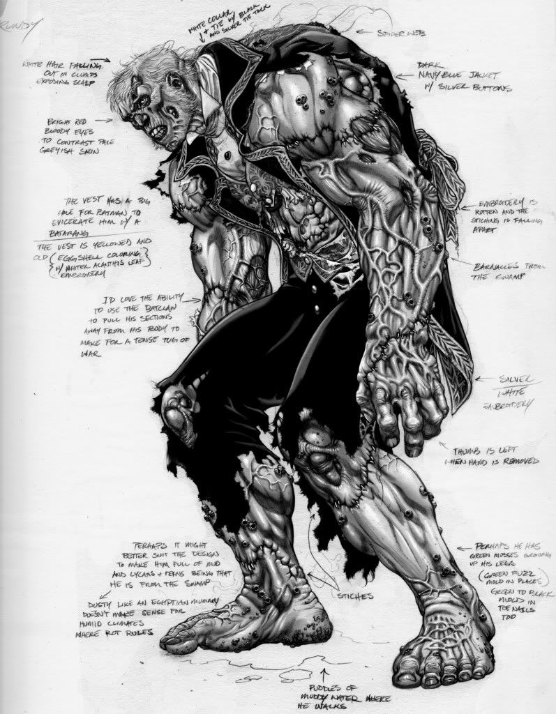 4. My favorite character in the DC Universe is Solomon Grundy, What was your inspiration when you were designing him for the game?
Ideally when tackling him I think of who he was juxtaposed with who he is… so initially you have to think of the hulk mixed with a zombie that’s been rotting out in the marsh. And that informs his naked body but his clothes have to remind you of who Cyrus gold really was a wealthy business owner from a bygone Victorian era so this make his clothing a period piece design for me. though the final design came quickly, his clothing was changed ever so slightly for the game removing some of the decayed ornate embroidery, tattered vest and under shirt, barnacles, seaweed, and swamp critters on him for fear that he would look too Pirates of the Caribbean. In the end the design is very similar to what I originally produced but with a slightly more simplified clothing. This was a design that I did around an initial idea that they had for how batman fought Grundy. Originally they wanted to have batman tear pieces of Grundy off, I think with the Bat claw which I would have loved to see, but agreed might have been a tad gory for some of the fan base. The inspiration being that Cyrus gold kept getting chopped up into little pieces and dumped in the swamp where he would be revived. So the big veins originally carried swamp water mud and mosses and the stitches were meant to be popped, to pick him apart piece by piece. But his drawing turned out as one of my favorites because I’m big into bodybuilding so anytime where I get to draw an unnaturally muscular humanoid that couldn’t possibly exist I’m all over it.
5. Which was the greater challenge, designing the more iconic characters or the lesser known ones?
If I’m designing for a book neither is challenging if you let their story inform the way they look. But for a big budget game they all present problems because you have to think about how the light will catch the outfit and how it will move. And for this game I had to go slightly less realistic than I would have if I were designing for the Christopher Nolan movies. Some were challenging but so fun you don’t even notice, others so iconic that you go blank. I’d say my brain went blank the most with Two Face partly because his look really hasn’t changed all that much throughout the years and partly because they had a direction that they had settled on I think before I got to touch him. I did a number of designs in the beginning but doing something new really isn’t going to happen. So my focus was on the burns and how to make them appear realistic so it was about researching what a severe burn really looks like and then using that information to make something more closely familiar with what we all know. I really had hoped to do a full suit with a patchwork on one side of different gangster suits of various pinstripe materials taken from other mobsters he had murdered, with blood and ash and gunpowder running up his gun hand to inform the viewers what had happened in the past. But they wanted a sleeveless look that went from a mess of tangled tatters to no sleeve and pant leg at all but this was more about how to actually animate a series of tatters which I assume is not easy to get the physics right on. The only stamp I tried to leave was a phantom of the opera mask bolted to his head that looked like a creepy version of the iconic coin he carries with etch marks over the eye which was well received but we all knew that it just was too much a departure from the character that everyone knows. So I guess that’s a really long way to say iconic is harder for a larger viewer base.
WARNING SPOILER ALERT AHEAD!!!
Derf's Domain is proud to be the first to have exclusive designs of Clayface.
6. I also understand that you designed Clayface as well. How challenging was that?
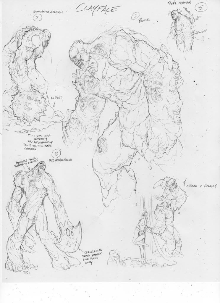
He was extremely difficult because at the end of the day they all felt right. Being a shape-shifter means that he can look like anything and doesn’t have any clothes so its basically about the face and basic anatomy. I ended up doing more drawings of him than any of the others fortunately he takes the least time to draw than anyone. So it really wasn’t a big deal. Though at the end they choose the first two designs I did the first drawing I did became the big Clayface and the second became the little multiples that batman slices up with the sword. So I thought that was pretty funny after all the hemming and hawing over him that we all did. I really liked that drawing that Carlos did in the first game but I knew they didn’t want him to be fat with the big double chin which I like for the character. So most of it was designing the head for me and how he would move or divide. some ideas they liked but were too much of a pain to make work like the no feet idea as though he were constantly falling apart when not concentrating too hard, he would be perpetually followed by little hunks of clay that wanted to be back on the whole of his body like in terminator two. Others were that his mass wouldn’t change just divide so a giant arm became three people but would be missing if sent out to fight batman, the one they liked the most but didn’t’ make it into the game was that his skin would be boiling and bubbling with faces of his, “characters” trying to get out. in the end I think this sounds a hell of a lot easier to do in a comic than make happen in an animated format. But this idea was in almost all of the drawings in some case they were just faces in others a whole hand or leg would reach out trying to escape and in others they would be a fully formed multiple that looked like a school girl or police officer. But he was fun and felt like lumping clay together and felt almost like I was doing lazy sculptures, I love sculpting and find it cathartic. But every drawing looked like Clayface to me so I didn’t even know which one I liked, none screamed to me, “hey it’s obviously me... pick me!”
7. Sticking with Clayface, were you allowed to use your creative mind to make cool weapons for Clayface to mold out of his body? If so, what can we expect?
I really didn’t want to go out of the scope of the cartoon here so I always went with blunt instruments that were iconic like the pendulum blade or morning star and all of those made it into the game. I always picture him smothering me to death or filling my lungs with clay so my drawings were more about how he moved and let them go more creative with the arsenal. The one weapon I liked the most was a drawing I did with him standing behind a curtain while he creates a little stripper dancing on a stage for a group of men he’s about to eat while her little muddy foot prints show you where she’d been. Obviously that would never make it into the game but as far as weapons go I think of his best weapons as his characters why stab you to death when he can lure you in with the promise of a pretty woman’s affections, then before you realize what’s happened… wham!

 What is your name and where are you from?
 I really love your version of Bizarro, do you have a favorite villain or hero?


